We update the pro widget with such useful features for big websites. We are happy all test where passed and after we updated our own projects there is very positive responses. And now enjoy all new implemented options.
ACF and WooCommerce will be supported
About found two WordPress plugins which helps building a great website: ACF (Advanced Custom Fields) and WooCommerce. We support selecting custom taxonomies and implement just WordPress core APIs. Up to now, you can use ACF custom field names or WooCommerce shortcodes in our Template area. We implement APIs and test with those two plugins to support WordPress core thinking and that extra, native plugin thinking. Demo page: Custom fields
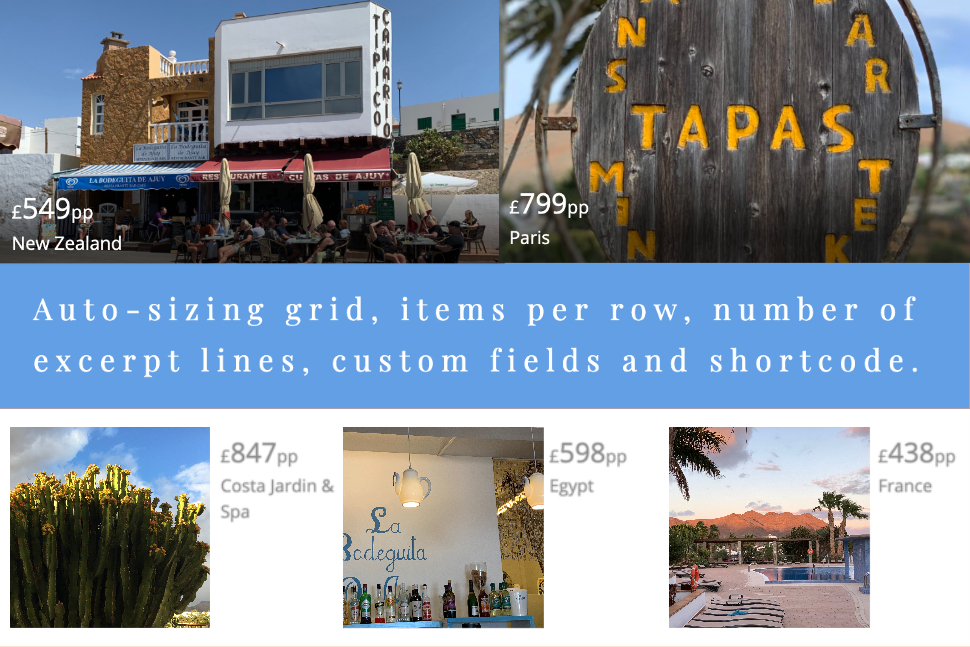
Content first: Our item width goes content-driven, no screen breakpoints
Internal we adapt the new auto-sizing grid CSS features. The browser handle the responsiveness for us. Only one option, the item width, is needed to showing fewer columns on smaller viewport sizes and more columns as the screen estate allows for more. After calling the browser to repeat-to-fill columns in a grid, he ask for that “(minimum) item width” and then auto-place items in them. No screen breakpoint need to do the responsive, auto-sizing grid. Instead we just need that single: “item width”.
Demo page: Auto-sizing grid
Range slider for Javascript framework Masonry
We like the effect when items get re-aranged with Masonry. And for shure it’s very usefull to place items in optimal position based on free space. Third quality Masonry didn’t handle only one item width, Masonry can handle two and more width. The internet like it. We like it. It’s usefull. But what’s the unique selling point about the new CSS auto-sizing grid? The difference is in the configuration. With Masonry it’s possible to specify the dynamic number of items per row. CSS auto-sizing grid needs a (minimum) width for each item. And that’s how it should be that a new slider control has been created for the items per row option.
Responsive line numbers
We guess, the length of the Excerpt text should be specified exactly by specifying the number of lines. That for different post widths or screen sizes, the layout should not be protracted. Because it doesn’t exist anything in this form in the past, there was only solutions built-around.
We want to get rid of the WordPress old excerpt filter hooks in our core code and implement a recent CSS attribute, “line-clamp”, to have that option to set numbers of text lines.
We’ll put everything on the new CSS attribute. With the ‘line-clamp’ CSS property it’s possible to truncate the excerpt text at a specific number of lines without text width site-effects on small screens.