Menu
Documentation relevant to all 4.8.x releases – Term and Category Based Posts Widget
Other documentation: 1.0.x, 4.6.x, 4.7.x, 4.8.x
(The minor x version number means patch versions)
Note: If you have any question about how to configure the widget for which you can not find an answer on this page, please ask on our support page. As it is personal for you and easy for use to answer questions there.
Widget
“Term and Category Based Posts Widget”
Server Requirements
- PHP version 5.3+ and higher
- WordPress version 4.0 and above
General features
The plugin enables you to easily display recent posts. You can control the post types and taxonomies from which the list of posts is extracted, in addition to the number of posts and sort order.
It can be inserted as a widget in a sidebar or as a shortcode [termposts] in the content.
You can control the general layout of the display – how the post items are visually arranged, and what is displayed for each posted item.
The available layouts of display:
- Single column / Vertical
This is the classical WordPress widget layout, all post items are listed vertically top to bottom.
It is also possible to have the post items to slide in a “news ticker” style, were a mouse hover stops the automatic sliding. - Single Row / Horizontal
All post items are displayed from left to right (right to left in properly configured RTL themes). It is not designed to be responsive and when the available space is not wide enough to display all data, a scrollbar will be displayed, or the rightmost items are hidden.
It is possible to have the post items to slide in a “news ticker” style, were a mouse hover stops the automatic sliding. - Auto-sizing Grid
A responsive version of the single row layout that can be used when you want to make sure that all the post items are always being displayed as a grid. ‘Item width’ should be set to auto-size how many items will take place to each row. The ‘item width’ set a minimal width before the number of items per row will be re-calculated automatically. All the post items are displayed from left to right (right to left in properly configured RTL themes). When there is not enough space to show the next item it is displayed in a new row. - Table
This layout can be used to achieve a grid effect. The items are displayed in a table, starting in the top-left cell and ending in the lower right.
A table can be made responsive to a point if you don’t mind varying amounts of space between the columns. - Masonry
This layout generates a grid dynamically based on a configured grid. Post items are organized to best fit the available width. It is also possible to set the maximal number of items per row and the minimal ‘item width’. It is responsive to browser window width and regenerates when window width is changed.
This layout depends on a JavaScript library and for users that disable JavaScript the display will be of a responsive row. - Slideshow
This layout generates a slider that has settings to edit a pager, transition behavior or next-/previous buttons. (It is much similar to the “NewsTicker” which can be used with “Single Column” and “Single Row”. The main difference is the “NewsTicker” stops only with mouse hover and has no other user controls like the Slideshow.)
Each posted item is roughly composed of three parts – thumbnail, title and excerpt with each part have its dedicated settings that control the way it is displayed. The thumbnail can be used as a background (cover) to the textual parts, placed above them, placed below the title or aligned to any side.
You can have post items displayed in two different ways, referred to as “alterations”, and set a pattern to decide when does each alteration is being displayed. An easy usage example, you can have the thumbnail of odd post items to be aligned to the left, while on even ones it is aligned to the right.
Shortcode
By using the [termposts] shortcode you can insert a unique widget into any place in content. The shortcode has the same functionality and configuration options as a “normal” widget.
By using the [termposts name="xxxx"] shortcode you can insert a unique widget into any place in content. The shortcode has the same functionality and configuration options as a “normal” widget.
The “name” parameter is optional if you have only one shortcode in the content, but should be specified if you have more than one shortcode. It is used to identify the shortcode both internally and in the customizer.
Insert and configuration
The shortcode [termposts name="xxxx"] can be inserted in any type of content, anywhere. It is used to indicate where the widget will be displayed in the content. There can be only one shortcode per post/content, with the same “name”, unless you intentionally want to display the same thing in a different location. Remove it by deleting the shortcode from the content. Changing the “name” is equivalent to removing the original one and creating a new one.
Once the shortcode is in the content you need to get to the customizer for the post. The easiest way to do that is to go into preview from the post editing screen and click the “Customize” menu on the “admin bar”. In the customizer you will find the “Category Posts Shortcode” Section and entering it will show you a list of subsections that lead to a form with which you can configure the display of the shortcode. Each subsection is labeled by the value of the “name” attribute, while if no name was given the label will be “[shortcode]”. Read more in one of our blog posts.
There is a helper button added to the editor to help with the insertion
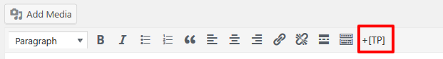
And clicking on it will open the next window
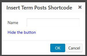
In which you can insert the “name” attribute, but it is not mandatory.
Administration
When used as a sidebar widget, it is possible to add, remove and configure the widget either through the widget admin page or via the customizer. When used as a shortcode you can insert the shortcode into any type of content, and then go to the customizer to configure what the shortcode displays.
In both cases, the configuration form looks and behaves the same
There are many aspects to the widget you can control including which posts will be displayed in it and some styling to the way they are displayed.
Since there are many options to control, to ease keep the admin area in a reasonable height we have divided the options into “panels” in which related options are being grouped. You can open (expose the options) and close (hide them) by clicking the title of the panel.
Except for the visual effects, changing the options behaves exactly as it behaves in any other WordPress widget, both in the widgets admin screen and in the customizer.
Some of the behavior of the admin part itself can be customized in the user profile, Read more about it.
Widget Title
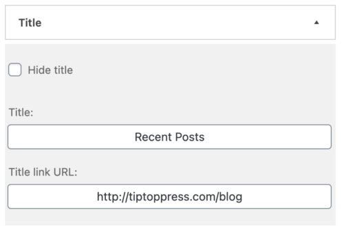
Here you can find options to control what is displayed above the widget, also known as its title. You can either not display a title at all, display some simple text, or display a link to the relevant category page.
The specific options are
- Title: The text that is being displayed as the title, If empty, the title will not be displayed at all.
- Title Link URL: If not empty the title will become a link to the URL specified here.
Note: How to combine categories in one link you can be read here
Note: If you add the widget as a shortcode in the content you can write a widget title also above the added shortcode.
Filter
Here you can control which posts will be displayed in the widget. You can control their number and the sort criteria by which they are selected and displayed.
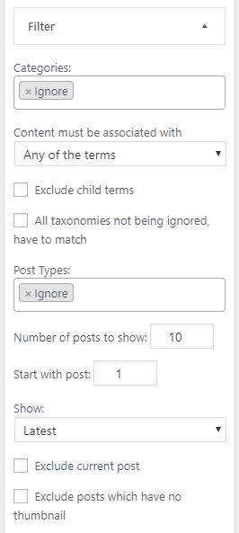
The options are:
- Tags, categories, and other terms: For each public taxonomy which is defined in the site (categories and tags for a blog-style site, product categories and attributes if you have WooCommerce, etc) a selection/menu box is displayed in which you can select posts from which selected terms of those taxonomies (i.e. specific categories, specific tags, etc.) will be displayed.
To be displayed a post has to be associated with any of the selected terms. This means that if you select category A and tag B, posts which are in category A will be displayed even if they are not in tag B, and vice versa. Of course, posts that are both in category A and tag B will be displayed as well
If you do not care about filtering by a specific taxonomy, you can set it to “Ignore“. This will cause that taxonomy to be ignored for filtering, and posts that are associated with any terms in it, or not associated at all, will be displayed based only on the other filtering criteria.
usage: Clicking on the input area will open a drop-down menu from which you can select the terms to filter by. You can also add them by writing their name and the drop-down will adjust dynamically to show relevant matching terms. To remove a term, just click on the small”x” to the left of the term name. Per each taxonomy, it is possible to specify what kind of terms should match the selected term- Content must be associated with: define the relationship between the terms associated with the post and the selected term
- Any of the terms: For a post to match, it should be associated with any of the selected terms
- All of the terms: For a post to match, it should be associated with all of the selected terms
- None of the terms: This is a “negation operation” and for the post to match it must not be associated with any of the selected terms
- Exclude child term: Displayed only for hierarchical taxonomies. If selected, posts belonging to the child terms of the term to filter by will not be displayed. If not selected they will be displayed.
Note: These options will be shown, if you select a category (not ‘any’).
- Content must be associated with: define the relationship between the terms associated with the post and the selected term
- All taxonomies not being ignored, have to match: If selected, only posts which match all the not ignored taxonomies be displayed, otherwise posts which match any not ignored taxonomy will be displayed.
- Post Types: For each public “post type” which is defined in the site (posts and pages on a simple site, products if you have WooCommerce, etc) a selection/menu box is displayed in which you can select posts from which post type will be displayed.
Unlike the term filtering, to be displayed a post has to belong to any of the selected post types. Posts that do not belong to any of them will not be displayed.
If you do not care about filtering by post types, you can set it to “Ignore“.
usage: Clicking on the input area will open a drop-down menu from which you can select the post types to filter by. You can also add them by writing their name and the drop-down will adjust dynamically to show relevant matching post types. To remove a post type, just click on the small”x” to the left of the post type name. - Authors: On a site with many authors a selection/menu box is displayed in which you can select posts from which author will be displayed. This is not being displayed at all if there is only one author at the site.
Unlike the term filtering, to be displayed a post has to belong to any of the selected authors. Posts which do not belong to any of them will not be displayed.
If you do not care about filtering by authors, you can set it to “Ignore“.
usage: Clicking on the input area will open a drop-down menu from which you can select the author (by his display name) to filter by. You can also add them by writing their name and the drop-down will adjust dynamically to show relevant matching authors. To remove an author, just click on the small”x” to the left of the author’s name. - Number of posts to show: The number of posts that will be displayed in the widget.
- Start with post: A numeric that can be used to indicated that the widget will not display the post that are the “highest” results of the sorts criteria, but at some offset from the “first” result. A value of 1 indicates that the “first” item should be displayed and then the items “after” it. A value of 2 indicates that the “second” value should be displayed and then the items “after” it, etc.
This is useful if you want to have two “latest news” widgets that display the recent post where one displays the N “latest” ones in a different way than the rest. - Date range: Show posts that are published which match to a specific date.
- Days ago: Posts shouldn’t be older than x days.
- Up to: X days.
- Between dates: Have posts which shown permanently and they are published at a specific date.
- After: Date should be older.
- Before: Date should be younger.
- Days ago: Posts shouldn’t be older than x days.
- Show: The sort criteria used to select which posts out of all posts associated with the category are actually going to be displayed. It also controls the display order.
Sort options are:- Latest: Posts are sorted by their publish time. When selected The posts will be displayed from latest to oldest
- Have more Comments: Posts are sorted by the number of comments they have. The posts with more comment are displayed first
- Random: No sort at all, posts are randomly picked to be displayed on every new page load.
Note: Sometimes this option is useful which is why we provide it, but it is more resource demanding, and when using any type of page caching, you will get randomness only when the page cache is regenerated and not with every page load.
- Exclude current post: If selected, when the widget is displayed on a post that matches all other criteria, the post itself will not be displayed as part of the widget. This behavior is useful if you use the widget to direct users to other posts, and displaying a link to the post the user is already on, is a waste of space.
- Exclude posts which have no thumbnail: If selected, posts without a thumbnail/featured image will not be displayed. This is useful if you enable the display of thumbnails, and want to avoid style mismatches where some posts are displayed with and some without thumbnails. This is really just a stop-gap measure, and it is much better to make sure all relevant posts have featured images.
Style
In the style panel, you control the layout of the post items. The style panel is composed of two main parts, the general layout and alteration pattern. Since each layout has its own distinct settings we are going to cover each layout by itself here and then cover the alteration
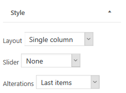
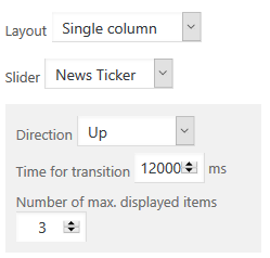
Single column
In this layout, the post items are arranged in a vertical list, which can be a simple list or a “news ticker” style slider
- Slider: Whether the posts are displayed as a simple list, or “news ticker” style vertical slider
- None: The posts will be displayed as a simple list
- News Ticker: The posts will be displayed in a sliding “news ticker” style. This feature is implemented in JavaScript and if JavaScript is not available on the browser it will fallback to a simple list.
To control the behavior of this specific style you will have the following options:- Direction: Controls the direction in which the sliding happens. Can be either “Up” or “Down”
- Time for transition: The time it will take to scroll through all of the posts.
- Number of max. displayed items: The number of posts that will be visible on the screen at any given time. Obviously this should probably be lees the max number of posts configured in the filter panel.
Single row
In this layout the post items are arranged in a horizontal list, which can be a simple list or a “news ticker” style slider
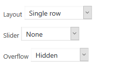
- Slider: Whether the posts are displayed as a simple list, or “news ticker” style vertical slider
- None: The posts will be displayed as a simple list. Spacing between items and behavior in case of overflowing can be configured as well
- Overflow: What should be done in case the list is wider than the available area. The possibilities are
- Hidden – Everything that is overflowing is not being displayed at all. This setting do not respect items boundaries, meaning that overflowing item might be “cut” in the middle
- Show Scroll – A vertical scroll bar will be displayed beneath the list
- No handling – Use whatever defaults the theme has set to handle this kind of situations (technically speaking, this just means that no CSS rules to handle overflow will be attached to the element by the plugin)
- Overflow: What should be done in case the list is wider than the available area. The possibilities are
- News Ticker: The posts will be displayed in a sliding “news ticker” style. This feature is implement in JavaScript and if JavaScript is not available on the browser it will fallback to simple row with a scrollbar appearing if the items take more space then the available width of the row.
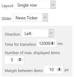

To control the behavior of this specific style you will have the following options:- Direction: Controls the direction in which the sliding happens. Can be either “Left” or “Right”
- Time for transition: The time it will take to scroll through all of the posts.
- Number of max. displayed items The maximal number of post items that will be visible on the screen at any given time. The actual number varies based on the width of the available area.
Obviously this should probably be lees the max number of posts configured in the filter panel. - Margin between items: The margin in pixels between the post items. This setting is preferred over CSS margins as the JavaScript code need to do exact positioning calculation for which it needs to know in advance the margin.
- None: The posts will be displayed as a simple list. Spacing between items and behavior in case of overflowing can be configured as well
Auto-sizing Grid
In this layout post items are arranged in rows. A new row is automatically started when the next item will overflow the available width of the container. This is managed by the browser and adjusted whenever the size of the window changes.

- Item width: Should be set to auto-size how many items will take place to each row. The ‘item width’ set a minimal width before the number of items per row will be re-calculated automatically.
Table
In this layout post items are organized in a grid (HTML table based). You can set the number of the columns a table has and the number of rows will be automatically decided based on the number of items being displayed. You can use alteration settings to have some items spread over more than one cell.
Tables are not responsive. You can get some responsiveness by using an equal distribution of the columns but the responsiveness will have effect only as long as you have some spacing between the columns.
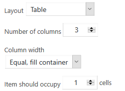
Settings are:
- Number of columns: The number of columns the table has
- Column width: How to calculate the width for a column. The two options are “Equal Fill container” in which all columns will have the same width in a way which will cover all of the available width, or “content width” in which each column width will be equal to the biggest item in the column and no spacing between them (unless to add relevant rules in your CSS).
- Item should occupy “n” cells: This should be “1” for all trivial tables, but when you want to create a more “interesting” pattern by using alteration, it is not as simple as it seems. For a simple example, if you want a table with some rows having two items while others having one, you might want to set the column number to “2”, set this value to “2” to create a one item row, and set the relevant alteration option to “1” to create a two-item row
Masonry
This is a dynamic responsive layout that arranges the items based on a grid “rulers” to best fit the available area. It is a JavaScript-based layout, which adjusts automatically to different window widths, and it falls back to a responsive row layout if JavaScript is not available on the browser.

Setting are:
- Item width: The ‘item width’ set a minimal width. If there is not enough space the number of items per row will decrease.
- Items per row: Maximum number of items per row. After reaching the ‘item width’ the number of items per row will decrease.
- Margin: The horizontal margin between items.
Slideshow
A slider which has settings to edit a pager, transition behavior or next-/previous buttons. (It is much similar to the “NewsTicker” which can be used with “Single Column” and “Single Row”. The main difference is the “NewsTicker” stops only with mouse hover and has no other user controls like the Slideshow.)

- Items min-width: For horizontal Layouts to set the post’s width.
- Next- / previous icons: Shows buttons to move the slideshow.
- Fade effect (just one element): Move with an overlay effect. (Only one item is displayed at a time.)
- Auto scroll: If not selected the items will be scroll only with the buttons or the pager below.
- Loop: On the last slide it will transition to the first slide and vice-versa.
- Vertical: Slides will scroll vertical.
- Transition time (ms): Time to move to the next item.
- Pause time (ms): Time between each auto transition.
- Max. displayed items: Maximum items to be shown. Items will be sized up if Slideshow becomes larger.
- Items to move: If set you can scroll n-items at once.
- Use a pager below: Dots or preview images with custom dimensions.
Note: The Slideshow can be used as image slider if the filter is selected to Post Type: Media. Therefore we recommend the Media Library Organizer plugin to create Categories for the Media pictures which can be easily selected also with our widget filter.
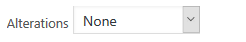
Alterations
Alterations enable you to “spice up” the display by having different styles for post items based on their location. When alteration mode is active, you will have an additional panel in which you can configure the thumbnail and details setting for the alteration.
In the style panel itself, you can configure the pattern which is used to decide when an alteration is being displayed
There are two possible alteration patterns – first (normal) / last (alteration), and a general pattern
- Last items: In this mode the first n item follows the “normal style while starting from item n+1 the alteration style is being used.
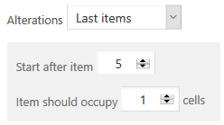

- Start after item: Indicates what is the last item to be used for the normal styling. All items till, and including, this one will be styled normally, while all the rest of the items use the alteration styling.
- Item should occupy: This is a setting for alteration in table layout and lets you specify how many cells an alteration item should occupy.
- Repeat pattern: In this mode, you specify what is the first item for which alterations are applied, for how many items they should be applied as well, and after how many “normal” item alterations should start again
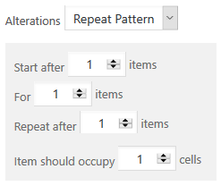

- Start after: Indicates what is the last item to be used for the normal styling before starting to apply the alteration pattern. All items till, and including, this one will be styled normally, while all the rest of the items use the alteration when the pattern matches
- For: The number of items that will be styled with the alteration style.
- Repeat after: After all the alterations indicated in the “for” parameters were displayed, how many items should be displayed with normal styling before starting alterations again.
- Item should occupy: This is a setting for alteration in table layout and lets you specify how many cells an alteration item should occupy.
Post details
Template

Here You can control the post detail parts, which appears as part of the post item. All post detail will be placed as a placeholder. The text in the Template area can be a post detail placeholder, text, HTML or HTML for SVG icons.
Note: For the SVG-icon HTML we recommend the WordPress Dashicons, which are included as default and can be used without any icon-font including.
Placeholders:
| New line | Space |
|---|---|
| Empty line | Next line is a paragraph |
| %title% | Post title |
| %thumb% | Post thumbnail possibly wrapped by text |
| %date% | Post publish date |
| %excerpt% | Post excerpt |
| %more-link% | Read more link |
| %author% | Post author |
| %commentnum% | The number of comments to the post |
| %post_tag% | Post tags |
| %category% | Post categories |
| %custom-field% | Custom fields (name) associated to the post |
| [shortcode attr=”val”] | Shortcode and attributs |
Note: How it works? and Examples.
Note: There is a new button “Add placeholder” for easy add post details placeholders you can use in the Template.
- Select this template: Here we give premade example Templates. Choose one and select it with the button below to take it over.
- Everything is a link: Each posted item, including all its components, is a link to the post.
Item Title
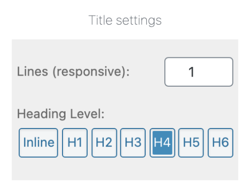
- Lines (responsive): Set the shown item title lines and cut after the set lines with three dots. It doesn’t matter if the post width which is shown will get smaller or bigger, the shown lines are always the same.
- Heading Level: Render a heading HTML tag (H1, …, H6) or a span inline tag.
Excerpt

- Lines (responsive): Set the shown excerpt text lines and cut after the set lines with three dots. It doesn’t matter if the post width which is shown will get smaller or bigger, the shown lines are always the same.
More Link
- ‘Read more’ text: Adds a link to the post. Text in the ‘more’ link. Can be text, HTML and Dashicons.
Date format
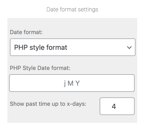
The options are:
- Date format: Select the format in which the date will be shown.
- PHP Sytel Date format: The format of the date may be any combination described on this page.
- Show past time up to x-days: The range from post was publish date till now.
Thumbnails
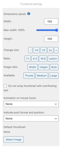
Here you can control how thumbnails are being displayed
Options are:
- Use thumbnail as background: If selected the thumbnail will be displayed behind the text describing the post, if not selected it will be displayed to the left of it or on the right sites.
- Thumbnail dimensions (in pixels): You should set here The dimension of the thumbnail in pixels. It is best to set both dimensions but if you set only one the system will try to figure out the other.
- Max width in %: To have responsive images proportional to the post width. The default setting is 100%. Choose another value to change the responsive image width in percentage.
- Change size: Simple increase or decrease the thumb dimensions.
- Ratio: Set a common ratio.
- Image ratio: Set one or both dimensions to ‘0’.
- Width: Use the width. It will be always the same for all shown posts. The height is calculated and has the original image ratio.
- Height: Use the Height. It will be always the same for all shown posts. The width is calculated and has the original image ratio.
- Both: The width and height will be calculated and have the original image ratio.
- Available: Choose an available Media size.
- Animation on mouse hover: Set the visual effect to happen when the user is hovering a thumbnail. The possible effect is:
- Darker: The thumbnail image will get a darker tone to it.
- Brighter: The thumbnail image will get a brighter tone to it.
- Zoom In: The thumbnail image will be zoomed into.
- Blur: The thumbnail image will be blurred.
- Icon: An icon is shown for the default post format.
- Indicate post format and position: Is a post assigned to a different post format as the default format, it is indicated with an icon and can be placed at different positions. The “Html without styling” option can be used, if a used Theme has own styles and hasn’t be overridden.
- Default thumbnail: Select an image to be used as the thumbnail if no thumbnail is configured for the post. The selection process utilizes the internal media library which means that you can either select an already uploaded image or upload a new one.
Shortcode in the Template
We support shortcode in the template area and so it is also possible with ACF shortcode. The usage of ACF Shortcode can be read in our FAQs or here.

General
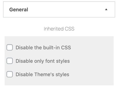
Here you can set some miscellaneous options.
Inherited CSS
- Disable the built-in CSS for this widget: If selected no CSS will be added automatically to style the specific widget. Any styling will have to be done by adding your own CSS rules.
- Disable only font styles for this widget: If selected no CSS will be added automatically to style the text in the widget. Any styling will have to be done by adding your own CSS rules.
- Disable Theme’s styles: WordPress core use and adds CSS classes to rendered HTML. Most Themes supports CSS selectors for some of those CSS classes and also with widget will be styled like other Theme’s elements. If you don’t want those styles for the widget you can disable the checkbox.
Interim text
- Hide widget or show text, if there are no matching posts: Choose what should happen, if there are no posts in the category (or none have a thumbnail, if the hide posts without thumbnail option are selected), The widget will not be displayed at all, which in practical terms means that the title and footer will not show.
- Display empty widget: Widget header and footer are shown.
- Hide widget: Nothing is shown.
- Show text: The chosen text is shown.
Ajax API
Enable Load More: Enable the checkbox to use the load more posts function. The number how many posts will be loaded each time the load more button is clicked is like the same how many posts are shown set in the Filter panel with the option “Number of posts to shown”.
- Button text: The button text. You can use two placeholders into the text.
| %step% | Loaded items |
|---|---|
| %all% | All possible items for the set filter query |
- Load text: Change the text which is displayed, if more posts will be loaded.
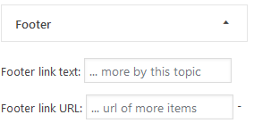
Here you can set how the footer of the widget looks
Options are:
- Footer link text: If not empty a link to the relevant category page will be displayed in the footer, with the text being used as the anchor text of the link.
- Footer link URL: When non-empty the footer text will be turned into a link.
Note: How to combine categories in one link you can be read here.
Configuration in the user profile
In the user profile, the user can change the behavior of the admin for himself
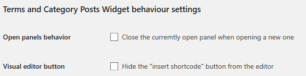
- Open panels behavior: When selected, only the “current” panel in the widget admin is displayed, and when a new one is being opened to be displayed the “current” is being hidden.
When not set, the user has explicitly “close” panels. - Visual editor button: When selected, the shortcode insertion button in the editor will not be displayed.
Did you not find what you were looking for? please use the support form.