Menu
Documentation relevant to all 4.6.x releases – Term and Category Based Posts Widget
Other documentations: 1.0.x
(The minor x version number means patch versions)
Widget
“Term and Category Based Posts Widget”
Server Requirements
- PHP version 5.3+ and higher
- WordPress version 4.0 and above
General feature description
The plugin enables you to easily display recent posts. You can control the post types and taxonomies from which the list of posts is extracted, in addition to the number of posts and sort order.
It can be inserted as a widget in a sidebar or as a shortcode in the content.
You can control the general layout of the display – how the post items are visually arranged, and what is displayed for each post item
The available layouts of display:
- Single column / Vertical
This is the classical WordPress widget layout, all post items are listed vertically top to bottom.
It is also possible to have the post items to slide in a “news ticker” style, were a mouse hover stops the automatic sliding. - Single Row / Horizontal
All post items are displayed from left to right (right to left in properly configured RTL themes). It is not designed to be responsive and when the available space is not wide enough to display all data, a scrolbar will be displayed, or the right most items hidden.
It is possible to have the post items to slide in a “news ticker” style, were a mouse hover stops the automatic sliding. - Responsive rows
A responsive version of the single row layout that can be used when you want to make sure that all the post items are always being displayed All the post items are displayed from left to right (right to left in properly configured RTL themes). When there is not enough space to show the next item it is displayed in a new row - Table
This layout can be used to achieve a grid effect. The items are displayed in a table, starting in the top left cell and ending in the lower right.
A table can be made responsive to a point if you don’t mind varying amount of space between the columns. - Masonry
This layout generates a grid dynamically based on a configured grid. Post items are organized to best fit the available width. It is responsive to browser window width, and regenerates when window width is changed.
This layout depends on a JavaScript library and for users that disable JavaScript the display will be of a responsive row.
Each post item is roughly composed of three parts – thumbnail, title and excerpt with each part have its dedicated settings that control the way it is displayed. The thumbnail can be used as a background (cover) to the textual parts, placed above them, placed below the title or aligned to any side.
You can have post items displayed in two different ways, refereed to as “alterations”, and set a pattern to decide when does each alteration is being displayed. An easy usage example, you can have the thumbnail of odd post items to be aligned to the left, while on even ones it is aligned to the right.
Shortcode
By using the [termposts] shortcode you can insert a unique widget into any place in a content. The shortcode has the same functionality and configuration options as a “normal” widget.
Inserting removing and configuring a shortcode
The shortcode [termposts] can be inserted in any type of content, anywhere. It is basically used to indicated where the widget will be displayed in the content. There can be only one shortcode per post/content, you can insert two but it will just present the same content in both places. Remove it by deleting the shortcode from the content
Once the shortcode is in the content you need to get to the customizer for the post. The easiest way to do that is to go into preview from the post editing screen and click the “Customize” menu on the “admin bar”. In the costumizer you will find the “Category Posts Shortcode” Section and entering it will show you a form with which you can configure the displaye of the shortcode.
Preface to settings
There are many aspects to the widget and shortcode you can control including which posts will be displayed in it and some styling to the way they are displayed.
Since there are many options to control, in order to ease keep the admin area in a reasonable height we have divided the options into “panels” in which related options are being grouped together. You can open (expose the options) and close (hide them) by clicking the title of the panel.
Except for the visual effects, changing the options behaves exactly like it behaves in any other wordpress widget, both in the widgets admin screen and in the costumizer.
Title
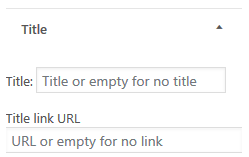
Here you can find options to control what is displayed above the widget, also known as its title. You can either not display a title at all, display some simple text, or display a link to the relevant category page.
The specific options are
- Title: The text that is being displayed as the title, If empty, the title will not be displayed at all.
- Title Link URL: If not empty the title will become a link to the URL specified here
Note: How to combine categories in one link you can be read here
Note: If you add the widget as shortcode in the content you can write a widget title also above the added shortcode.
Filter
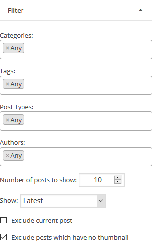
Here you can control which posts will be displayed in the widget. You can control their number and the sort criteria by which they are selected and displayed.
The options are:
- Tags, categories, and other terms: For each public taxonomy which is defined in the site (categories and tags for blog style site, product categories and attributes if you have woocommerce, etc) a selection/menu box is displayed in which you can select posts from which selected terms of those taxonomies (i.e. specific categories, specific tgs etc) will be displayed.
To be displayed a post has to be associated with any of the selected terms. This means that if you select category A and tag B, posts which are in category A will be displayed even if they are not in tag B, and vice versa. Of course posts that are both in category A and tag B will be displayed as well
If you do not care about filtering by a specific taxonomy, you can set it to “Any“. This will cause that taxonomy to be ignored for filtering, and posts that are associated with any terms in it, or not associated at all, will be displayed based only on the other filtering criteria.
usage: Clicking on the input area will open a drop down menu from which you can select the terms to filter by. You can also add them by writing their name and the drop down will adjust dynamically to show relevant matching terms. To remove a term, just click on the small”x” to the left of the term name. - Post Types: For each public “post type” which is defined in the site (posts and pages on a simple site, products if you have woocommerce, etc) a selection/menu box is displayed in which you can select posts from which post type will be displayed.
Unlike the term filtering, to be displayed a post has to belong to any of the selected post types. Posts which do not belong to any of them will not be displayed.
If you do not care about filtering by post types, you can set it to “Any“.
usage: Clicking on the input area will open a drop down menu from which you can select the post types to filter by. You can also add them by writing their name and the drop down will adjust dynamically to show relevant matching post types. To remove a post type, just click on the small”x” to the left of the post type name. - Authors: On a site with many authors a selection/menu box is displayed in which you can select posts from which author will be displayed. This is not being displayed at all if there is only one author at the site.
Unlike the term filtering, to be displayed a post has to belong to any of the selected authors. Posts which do not belong to any of them will not be displayed.
If you do not care about filtering by authors, you can set it to “Any“.
usage: Clicking on the input area will open a drop down menu from which you can select the author (by his display name) to filter by. You can also add them by writing their name and the drop down will adjust dynamically to show relevant matching authors. To remove an author, just click on the small”x” to the left of the author name. - Number of posts to show: The number of posts that will be displayed in the widget.
- Show: The sort criteria used to select which posts out of all the posts associated with the category are actually going to be displayed. It also controls the display order.
Sort options are:- Latest: Posts are sorted by their publish time. When selected The posts will be displayed from latest to oldest
- Have more Comments: Post are sorted by the number of comment they have. The posts with more comment are displayed first
- Random: No sort at all, posts are randomly picked to be displayed on every new page load.
Note: Sometimes this option is useful which is why we provide it, but it is more resource demanding, and when using any type of page caching, you will get randomness only when the page cache is regenerated and not with every page load.
- Exclude current post: If selected, when the widget is displayed on a post which matches all other criteria, the post itself will not be displayed as part of the widget. This behavior is useful if you use the widget to direct users to other posts, and displaying a link to the post the user is already on, is a waste of space.
- Exclude posts which have no thumbnail: If selected, posts without a thumbnail/featured image will not be displayed. This is useful if you enable the display of thumbnails, and want to avoid style mismatches where some posts are displayed with and some without thumbnails. This is really just a stop gap measure, and it is much better to make sure all relevant posts have featured image.
Style
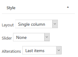
In the style panel you control the layout of the post items. The style panel is composed of two main parts, the general layout and alteration pattern. Since each layout has its own distinct settings we are going to cover each layout by itself here and then cover the alteration
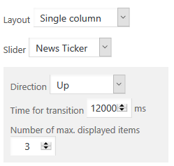
Single column
In this layout the post items are arranged in a vertical list, which can be a simple list or a “news ticker” style slider
- Slider: Whether the posts are displayed as a simple list, or “news ticker” style vertical slider
- None: The posts will be displayed as a simple list
- News Ticker: The posts will be displayed in a sliding “news ticker” style. This feature is implement in JavaScript and if JavaScript is not available on the browser it will fallback to simple list.
To control the behavior of this specific style you will have the following options:- Direction: Controls the direction in wich the sliding happens. Can be either “Up” or “Down”
- Time for transition: The time it will take to scroll through all of the posts.
- Number of max. displayed items: The number of posts that will be visible on the screen at any given time. Obviously this should probably be lees the the max number of posts configured in the filter panel.
Single row
In this layout the post items are arranged in a horizontal list, which can be a simple list or a “news ticker” style slider
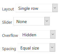
- Slider: Whether the posts are displayed as a simple list, or “news ticker” style vertical slider
- None: The posts will be displayed as a simple list. Spacing between items and behaviour in case of overflowing can be configured as well
- Overflow: What should be done in case the list is wider then the available area. The possibilities are
- Hidden – Everything that is overflowing is not being displayed at all. This setting do not respect items boundaries, meaning that overflowing item might be “cut” in the middle
- Show Scroll – A vertical scroll bar will be displayed beneath the list
- No handling – Use whatever defaults the theme has set to handle this kind of situations (technically speaking, this just means that no CSS rules to handle overflow will be attached to the element by the plugin)
- Spacing: How the spacing between the items is calculated. This is a responsive setting and the actual spacing size is dynamically calculated by the browser based on the actual available and used space.
- Equal size – Equal amount of space on both sides of each item (this basically means that the space on the right and left side of the list will be half the space between the items)
- Equal justified – The items are justified with equal spacing between them. Justified here means that the left most item will have its left side at the left most edge of the containing area, while the right most item will have its right side on the right edge of the containing area
- None – No spacing by default. If you would like to have any spacing you will need to add appropriate CSS rules.
- Overflow: What should be done in case the list is wider then the available area. The possibilities are
- News Ticker: The posts will be displayed in a sliding “news ticker” style. This feature is implement in JavaScript and if JavaScript is not available on the browser it will fallback to simple row with a scrollbar appearing if the items take more space then the available width of the row.
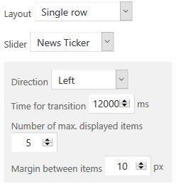

To control the behavior of this specific style you will have the following options:- Direction: Controls the direction in which the sliding happens. Can be either “Left” or “Right”
- Time for transition: The time it will take to scroll through all of the posts.
- Number of max. displayed items The maximal number of post items that will be visible on the screen at any given time. The actual number varies based on the width of the available area.
Obviously this should probably be lees the the max number of posts configured in the filter panel. - Margin between items: The margin in pixels between the post items. This setting is preferred over CSS margins as the JavaScript code need to do exact positioning calculation for which it needs to know in advance the margin.
- None: The posts will be displayed as a simple list. Spacing between items and behaviour in case of overflowing can be configured as well
Responsive Rows
In this layout post items are arranged in rows. A new row is automatically started when the next item will overflow the available width of the container. This is managed by the browser and adjusted whenever the size of the window changes.
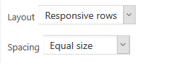
- Spacing: How the spacing between the items in each rows is calculated. This is a responsive setting and the actual spacing size is dynamically calculated by the browser based on the actual available and used space, but the spacing in one row might not be the same as in another.
- Equal size – Equal amount of space on both sides of each item (this basically means that the space on the right and left side of the list will be half the space between the items)
- Equal justified – The items are justified with equal spacing between them. Justified here means that the left most item will have its left side at the left most edge of the containing area, while the right most item will have its right side on the right edge of the containing area
- None – No spacing by default. If you would like to have any spacing you will need to add appropriate CSS rules.
Table
In this layout post items are organized in a grid (HTML table based). You can set the number of the columns a table has and the number of rows will be automatically decided based on the number of items being displayed. You can use alteration settings to have some items spread over more then one cell.
Tables are not responsive. You can get some responsiveness by using a equal distribution of the columns but the responsiveness will have effect only as long as you have some spacing between the columns.
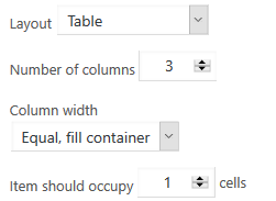
Settings are:
- Number of columns: The number of columns the table has
- Column width: How to calculate the width for a column. The two options are “Equal Fill container” in which all columns will have the same width in a way which will cover all of the available width, or “content width” in which each column width will be equal to the biggest item in the column and no spacing between them (unless to add relevant rules in your CSS).
- Item should occupy “n” cells: This should be “1” for all trivial tables, but when you want to create a more “interesting” pattern by using alteration, it is not as simple as it seems. For a simple example if you want a table with some rows having two items while others having one, you might want to set the column number to “2”, set this value to “2” to create a one item row, and set the relevant alteration option to “1” to create a two item row
Masonry
This is a dynamic responsive layout that arranges the items based on a grid “rulers” to best fit the available area. It is a JavaScript based layout, which adjusts automatically to different window widths, and it fall back to a responsive row layout if JavaScript is not available on the browser.
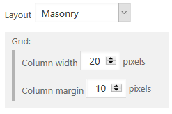
Setting are:
- Column width: This is the spacing between the possible left points of the post items For example, in the settings in the image above, post items can have their left edge either at the left edge of the container, 20*n pixels right to it. It has no impact on the width of the item itself. For example if a 110 pixel wide item will start on the left edge of the container, the next item will start at 120 pixels (20*6) to the right of the edge, and it will also start there if the first item is 105 or 115 pixels wide.
- Column margin: The minimal horizontal margin between items. With the settings in the image, if a 115 pixel wide item starts on the left edge, the next item will start at 140 pixel right of the edge (the next “ruler” for 115+10 is 20*7=140).
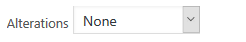
Alterations
Alterations enable you to “spice up” the display by having different style for post items based on their location. When alteration mode is active, you will have additional panel in which you can configure the thumbnail and details setting for the alteration.
In the style panel itself, you can configure the pattern which is used to decide when alteration is being displayed
There are two possible alteration patterns – first (normal) / last (alteration), and a general pattern
- Last items: In this mode the first n item follow the “normal style, while starting from item n+1 the alteration style is being used.
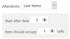

- Start after item: Indicates what is the last item to be used for the normal styling. All items till, and including, this one will be styled normally, while all the rest of the items use the alteration styling.
- Item should occupy: This is a setting for alteration in table layout, and lets you specify how many cells an alteration item should occupy.
- Repeat pattern: In this mode you specify what is the first item for which alterations are applied, for how many items they should be applied as well, and after how many “normal” item alterations should start again
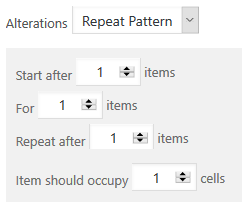

- Start after: Indicates what is the last item to be used for the normal styling before starting to apply the alteration patter. All items till, and including, this one will be styled normally, while all the rest of the items use the alteration when the pattern matches
- For: The number of items that will be styled with the alteration style.
- Repeat after: After all the alterations indicated in the “for” parameters were displayed, how many items should be displayed with normal styling before starting alterations again.
- Item should occupy: This is a setting for alteration in table layout, and lets you specify how many cells an alteration item should occupy.
Thumbnails and Thumbnails alterations

Here you can control how thumbnails are being displayed. The thumbnails is used to control the display of the thumbnails on the “main” items, while the “Thumbnails alterations” panel (displayed only when alterations are active) is used to control the display of the thumbnails in the alterations.
Options are:
- Show post thumbnail: If selected a thumbnail based on the featured image of the post will be displayed.
- Position: The position in which the thumbnail will be displayed relative to the title and the details. Possible positions are
- Top – Above the title and the details
- Top left – aligned left to the title
- Top right – aligned right to the title
- Details top – below the title, above the details
- Details left – below the title aligned left to the details
- Details right – below the title aligned right to the detailed
- Background – use the thumbnail as the background in which the title and details are displayed. Very important note: when in background position, the whole item is a link to the post, and due to HTML standard specification which prevent a link to be inside another link, all link oriented settings in the post details be will ignore and even titles will not have an explicit link over them (this is not important for the functionality but might be important for styling)
- Overflow text do not wrap the thumbnail: This option is available when the thumbnail is aligned and controls how the text to which it is aligned to behaves. When set the text will basically be aligned to the other direction, when not set, if the height of the text is bigger then the height of the thumbnail, the rest of it will wrap around the thumbnail and will be displayed below it.
- Dimensions (width and height): You should set here The dimension of the thumbnail in pixels.
Important notes on how images are made to fit the place- When an image is uploaded, WordPress generates automatically several versions of them in smaller dimensions. The widget will select the one which is closest to the requested dimension and use it. If the match is not exact the browser will be instructed to stretch the image to fit the area.
- In view of the previous point, you might want to use a plugin, or any any other appropriate tool, to instruct WordPress to generate images in the requested size (and then maybe run any plugin that regenerates them to make sure you have them for older posts as well). The motivation is mostly to avoid using big pictures to save bandwidth.
- Starting with WordPress version 4.4 images will be responsive. When possible, the widget will give the browser several images instead of one, and the context in which they should be preferred, for example an image for “normal” displays and an higher quality image for retina displays.
- Animation on mouse hover: Set visual effect to happen when the user is hovering a thumbnail. The possible effect are:
- Darker: The thumbnail image will get a darker tone to it.
- Brighter: The thumbnail image will get a brighter tone to it.
- Zoom In: The thumbnail image will be zoomed into.
- Blur: The thumbnail will get blurred
Post details and Post details alterations

Here You can control what text will appear as part of the post description. The “Post details” panel is used to control the display of the post details on the “main” items, while the “Post details alterations” panel (displayed only when alterations are active) is used to control the display of the post details in the alterations.
The options are:
- Hide post titles: When selected the post title will not be displayed
- Post width: This setting is available whenever the width of the post item can not be deducted from the thumbnail size (basically all the positions which align the thumbnail right or left), and an explicit width for the text needs to be given to know the width of the whole item. Knowing the width can be essential for all non vertical layouts. Obviously this should be wider then the thumbnail width (otherwise just use the thumbnail “top” positions). You can use the value “0” to indicate that you are going to set widths in the CSS, or willing be be brave and hope it will end well 😉
- Post titles align: The direction in which the text of the post title is aligned in its containing area. Possible options are:
- Right: The text is aligned to the right
- Center: The text is centered in the containing area
- Left: The text is aligned to the left
- Details align: The direction in which the text of the post details is aligned in its containing area. Possible options are:
- Right: The text is aligned to the right
- Center: The text is centered in the containing area
- Left: The text is aligned to the left
- Justify: The text is spread to align on both sides of the containing area.
- Show post excerpt: When selected, the post excerpt will be displayed
- Excerpt length (in words): If the excerpt is displayed, this can be used to control the number of words in the excerpt. If the excerpt have more words in it then the specified limit, a “read more” kind of text will be added to the end of it
- Excerpt ‘more’ text: The text to be used with the “read more” text being displayed when the excerpt limit is smaller then the excerpt size
- Show post date: If selected the date in which the post was published will be added to the post description
- Date format: The format of the date maybe any combination described on this page
- Make widget date link: If selected the date will be a link to the post
- Show number of comments: If selected the number of comments to the post will be appended to the post description
- Show post author: If selected the name of the author of the post will be appended to the post description
General
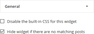
Here you can set some miscellaneous options
Options are:
- Disable the built-in CSS for this widget: If selected no CSS will be added automatically to style the specific widget. Any styling will have to be done by adding your own CSS rules.
- Hide widget if there are no matching posts: If selected, when there are no posts in the category (or none have thumbnail, if the hide posts without thumbnail option is selected), The widget will not be displayed at all, which in practical terms means that the title and footer will not show.
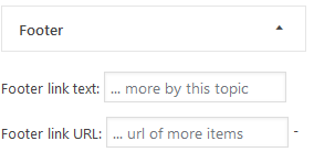
Here you can set how the footer of the widget looks
Options are:
- Footer link text: If not empty a link to the relevant category page will be displayed in the footer, with the text being used as the anchor text of the link.
- Footer link URL: When non empty the footer text will be turned into a link.
Note: How to combine categories in one link you can be read here.