We decided in the past to add a image cropping feature (CPW since 4.1.6, April 13th 2016, as option and TACBPW since 1.0.1, as default), to set your image dimensions in pixel for the feature image or called thumbnail. We called it “CSS cropping for thumbnails“.
This CSS cropping gives your image the possibility to set dimension options for width and height. Our decision till now is to perform this cropping with CSS. CSS is fast and the website admin can use, but it’s not a have to. And our feature don’t neet to generate new images or actually a change for image sizes in the WordPress settings.
We talk much about the feature and implement it to other widgets like Same Category Posts.
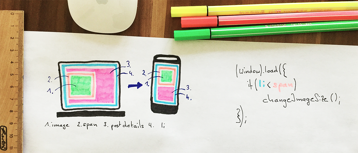
We started to solve the max-width problem for our client-side cropped images

The problem we had with our cropped images is we can’t use the CSS property max-width, because the cropping is also made with CSS. No CSS rule solve both features correctly at the same time and we set a fixed width and height. For Responsive Layouts this is very bad to have only one image size and the image can’t be resized, e.g. for many different mobile devices and screen sizes.
For the 4.7 we tried a CSS solution again to solve the aim to have fluid images with CSS attribute max-width. It’s Mark again who mentioned to try it with Javascript. And now it’ll be available with the 4.7 (4.7 beta 1).
The Javascript code works only once at page load or on page resize. Last one is in the normal website usage not performed. The Javascript code is also performance optimized and curse a very less millisecond delay while page load.
Demo page: demo.tiptoppress.com
Advantages with client-side responsive images:
- No additional (server-side) libraries required.
- No cookies required.
- No extra server configuration needed.
- Does not attempt to perform any client OS detection.
- Server image storage doesn’t change.
- Fast server response any time.
- No image quality loss.
- No side effects with frequent use on several pages.
Other image features for Responsive Layouts are planed
We’re happy we found a solution and we hope we don’t get problems and can solve the requested Responsive Layout support. What we also want is use the CSS attribute “width” like percentage unit (100%). And either for one dimension and the other as pixels or for both, no size restriction is given and the image fill all the available space. We planed it also for the 4.8 – be patient if all works right.


